ForbiddenKnowledgeTV
Alexandra Bruce
March 4, 2013
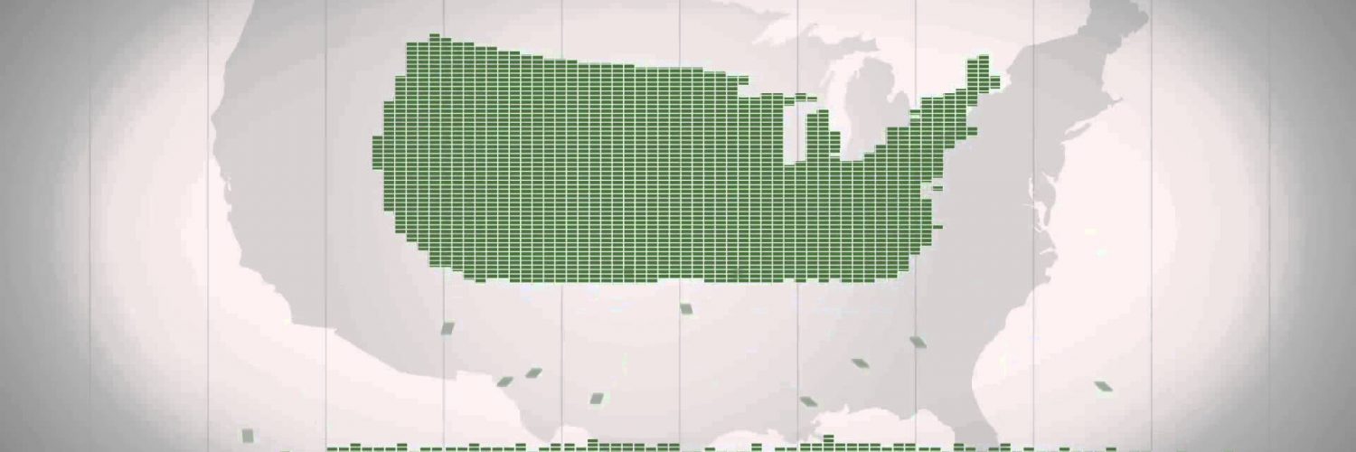
This infographic spread like wildfire through all of the social networks in early March of this year.
It’s about the distribution of wealth in America, highlighting both the inequality – and the difference between our *perception* of inequality and the *actual* numbers.
The upshot is that we think a certain amount of wealth inequality is fair but we think the current wealth inequality is unfair – but the reality is that we have NO idea how obscenely unfair that it actually is!


Add comment