

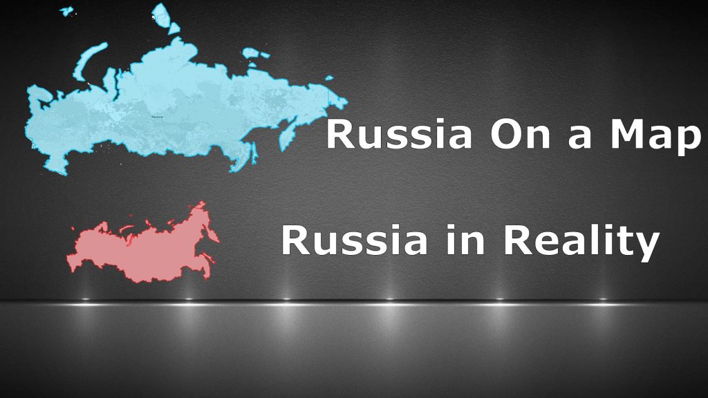

Most of us have an idea of what the world map looks like, based on its most popular representation, the Mercator Projection. This is an extremely flawed 2D representation of the Earth’s landmasses, due to the spherical shape of the planet. This clip shows how completely skewed the actual sizes are the
world’s countries, according the Mercator Projection.
world’s countries, according the Mercator Projection.
I have been being trolled by Flat Earthers in the Comments sections lately and I invite reasonable people to correct perpetrators and/or victims of the nefarious newfangled Flat Earth psyop/trope at will.